Visualizing Ski Slopes with d3.js
Click here to skip straight to the visualization.
I've always been fascinated with data vizualizations, whether it be maps, charts, graphs, or other methods of representing information. I am making an effort this year to improve my skills in this area, focusing on d3.js and supporting front end web technologies.
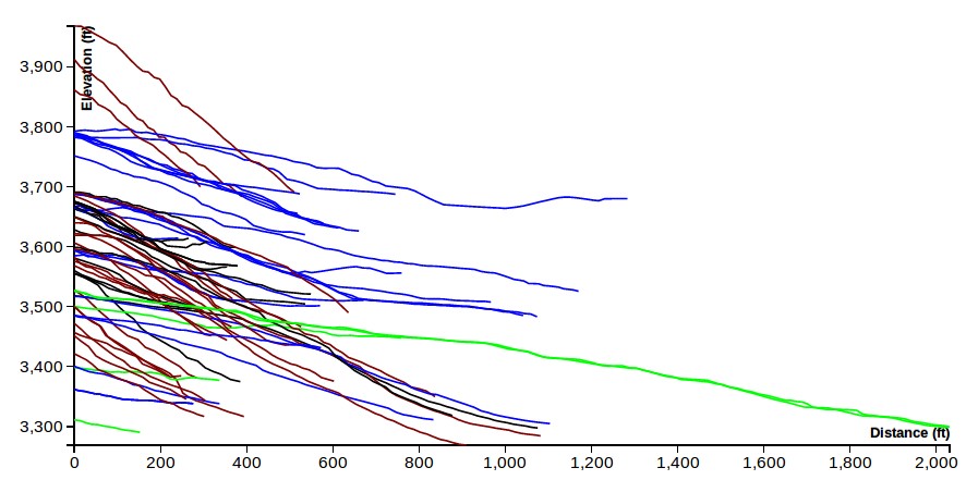
My first effort is a visualization of the slopes on the front side of the Arapahoe Basin ski area. I've been a skier for a while, and have always wondered how slopes compare in difficulty based on steepness alone. For those who are not skiers, slopes (at least in Colorado) are typically rated for difficulty by color and symbols: green circle for easiest, blue square for intermediate, black diamond for advanced, and double black diamond for experts only. There are many factors that influence the grading of slopes, but steepness is an easy one to quantify and visualize.
To make the dataset, I choose one of the smaller Colorado ski areas, Arapahoe Basin, and sent out to digitize slope profiles. Elevations were taken from the USGS NED 1/3 arc second DEM (digital elevation model). Paths were digitized by hand using using QGIS and the Profile Tool Plugin. I overlayed a Google Maps hybrid image over the DEM in QGIS, and used the slopes on the image to digitize the profile based on the DEM elevations.
Once I had the dataset prepped, I used straightforward d3.js techniques to create the line plot showing the multiple trails. In particulare, I relied heavily on this example which uses an invisible Voronoi overlay to provide reliable cursor tracking. I added some coloring and filtering methods to help differentiate the different slope grades.
You can see the final result here.
I had a lot of fun making this. If you have any questions, comments, or tips, please share them in the comments section below.
comments powered by Disqus